

I was going to catch up on some awards I have been lax in accepting lately but I am too excited not to share. The digital proof for my bookmarks and business cards came back. Now I have a head start having Mel’s amazing cover design to use as the basis for them but I still had to do a little cutting, pasting and manipulation so I am grabbing a tiny bit of the credit. So bear in mind I am a newbie to these sort of things and go gentle with me when you tell me what you think. Here goes the business card first..

Then the one which I am more excited about in more ways..
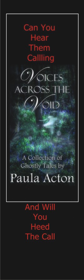 The back of the bookmark is black with my contact details on in red. So What do you think? I also realised I need to buy either a gold or silver pen that will write on the black otherwise I will have to write across the poor little girl ghost and that wouldn’t be good. I have approved the proofs and had a message back saying both are now on the print run so I guess it is just a case of sitting back and waiting to take delivery. I am getting so excited about the whole thing now but also a little scared. Here in the safety of my blog I have started developing a fragile belief in my abilities, you guys are so supportive and encouraging that it is easy to forget that not everyone will be. Recently I have seen authors begin to doubt themselves because of bitter, overly critical reviews, I have seen reviews where the style of the review is to rip books to pieces for effect even if they actually say they liked it, and I am going to be sticking my head out above the trenches for them to start taking pot shots. I am not sure if publishing is bravery or madness I suspect a little bit of both.

I really love this! No wonder you are so excited!!!
LikeLike
Good for you, Paula!
LikeLike
well done and keep on believing
LikeLike
You’re made of stiffer stuff than I am! You can do it. Lots of reward for your risk. 🙂
LikeLike
Nice job. And I like the across the void motif. 🙂
LikeLike
Great work! I like how you were able to use both versions of the cover, too. 😉 Congrats! 😀
LikeLike
I was going to use the newer one on both but when it was shrunk down to business card size the other was not quite so clear, I guess once you have a few things for people to know you by you dont need a pic on there but this was a bit of an experiment
LikeLike
I would like to offer to you some suggestions. I think your words should all be in white because the type would better match the one in Mel’s design. Red is symbolic of love, killing and darkness so it doesn’t fit well. Otherwise I love it. In the second one I would suggest you put your own writing outside the square and also put in white. One last suggestion would be to ask Mel what font she used and use that for your typeface because it ties the whole thing together better. I do like the black background though. Also I would suggest writing, “Can you hear them calling?”, then “Will you heed the call?” Otherwise it looks awkward.
LikeLike
Am stuck with this for the first print but will certainly bear in mind your suggestions if I am lucky enough to need to do some more xx
LikeLike
You might 😉
LikeLike
And keep your chin up Paula! There’s a lot of meanies out there that like criticize your writing for no reason. I wish you the best success on your book!
LikeLike
CONGRATULATIONS!!!!
I have nominated you for “The Shine On Award”! Thank you for being such a support to me!
Lots of love, Emily
“The Light-Bearer Series” Novelist
http://emilyguido.com/2013/01/12/shine-on-award-thank-you-all/
LikeLike
So proud of you. You’re my hero!
LikeLike
Really nice book marks
LikeLike
Congratulations, Paula. These look great 😀
LikeLike
Wonderfully done, congratulations
LikeLike
love it!
LikeLike
Oooooo, lovely! 🙂
Xx
LikeLike
Particularly love the bookmark.
LikeLike
they just arrived in the post today have done a little happy dance round the room 😀
LikeLike
Love the bookmark!
LikeLike